New Uniforms?
Moderator: Moderators
Re: New Uniforms?
As someone noted above, the gold in the embroidered Vikings text and in the swoosh on the shoes indicates that they may move away from the yellow of old. That would be in keeping with the direction that some teams have moved in recent years. Not sure I like it, but whatever. I wonder if we might even see gold pants or a gold road jersey.
Re: New Uniforms?
Exactly. Lighting, equipment, materials, etc. can all impact the look of colors.80 PurplePride 84 wrote:They changed the gold in the logo a little too, I don't think it's changing all too much. If they were going full gold then they woulda did it in the logo too like the Rams did.
The text definitely looks darker than the swoosh on the cleat. Put it could just be the lighting because the purple on the pic of the text looks darker than the purple of the one of the collar.
I can't confirm since I haven't unlocked those clues myself yet but I think those are clues 4, 5 and 6.So is it confirmed that the text was the 4th clue, cleat 5th and collar 6th? Or was the cleat not one of them and we still don't know the 6th.
Re: New Uniforms?
My main hope is they use the larger horns like on the throwback helmets.
Re: New Uniforms?
All we've really seen is an idea of what shade of purple they may use on the home jerseys. Or did I miss something? The team nickname below the neck opening has pretty much become standard now.mrc44 wrote:I'm so stoked ! The clues are pointing in the direction of the best jersey yet! It's tough looking for sure and I too am glad the collar is one color finally !
Last edited by Eli on Thu Apr 04, 2013 4:21 pm, edited 1 time in total.
Re: New Uniforms?
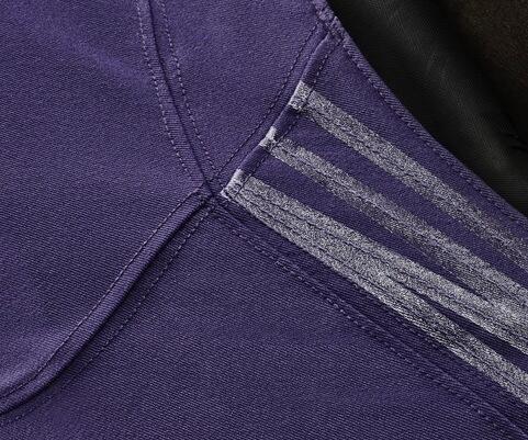
There is black in the collar in this picture. A little black wont look bad in my opinion but not a fan if they use a lot.Mothman wrote:@Vikeologist on Twitter shared this "hint pic" too:
As you can see when comparing it to the stitched "Vikings" logo above, the colors look a bit different from photo to photo. My guess is that the purple we see in this picture is probably a better representation of the uniform color than the darker purple in the photo of the Vikings logo.
Re: New Uniforms?
That's an undershirt.
Re: New Uniforms?
Gotcha! Thank you for pointing that out!Eli wrote:That's an undershirt.
That's even better.
-
PurpleMustReign
- Starting Wide Receiver
- Posts: 19150
- Joined: Mon Jan 24, 2005 5:48 pm
- Location: Crystal, MN
- Contact:
Re: New Uniforms?
Ok good, looks like the yellow collar is gone.9 wrote: Gotcha! Thank you for pointing that out!
That's even better.
The Devil whispered in the Viking's ear, "There's a storm coming." The Viking replied, "I am the storm." #SKOL2018
-
DarthBrooks
- Transition Player
- Posts: 340
- Joined: Mon Apr 21, 2008 12:01 am
Re: New Uniforms?
From Cris Creamers Sports Logo forum.

Even though the purple isn't supposed to change it looks more like the matte dark purple from the early 70's.
Even though the purple isn't supposed to change it looks more like the matte dark purple from the early 70's.
Re: New Uniforms?
Well, one thing I'm happy about based on that image of the "Vikings" below the neckline is they do appear to be going with a "retro" look somewhat. Or at least not going "modern" with drastic change. That is the way "Vikings" has looked forever. My favorite unis were actually the ones they went to in the 90s. With the Norseman on the sleeve and the yellow border around the numbers. But still with the classic stripe on the pants. I HATE the pants right now.
But with the hideous, awful unis the U of Oregon wears with a lot of involvement from Nike, I was scared to death they would come up with some horrible design for the Vikings.
At least at first glance, it looks like my fears will not be realized.
But with the hideous, awful unis the U of Oregon wears with a lot of involvement from Nike, I was scared to death they would come up with some horrible design for the Vikings.
At least at first glance, it looks like my fears will not be realized.
Re: New Uniforms?
They had virtually the same thing last year. (See the photo of Ponder above.) Looks like it may have been white with gold outline instead of all gold. Many teams had the team name/logo embroidered below the neck opening on the 2012 uniforms.majorm wrote:Well, one thing I'm happy about based on that image of the "Vikings" below the neckline is they do appear to be going with a "retro" look somewhat.
Re: New Uniforms?
I think the thinner font, with the solid color and without the border, makes it look a lot sleeker and less "blocky" or childish looking. That with the darker, more faded colors, it certainly does seem to have a more classic look. Hard to tell without the rest of the jersey, but I'm excited, I think they're going to be a very big upgradeEli wrote: They had virtually the same thing last year. (See the photo of Ponder above.) Looks like it may have been white with gold outline instead of all gold. Many teams had the team name/logo embroidered below the neck opening on the 2012 uniforms.

Re: New Uniforms?
Good! Go back to a real purple and gold. And not a glorified blue and yellow! 
-
PacificNorseWest
- Career Elite Player
- Posts: 2936
- Joined: Fri Nov 11, 2011 1:10 am
- Location: Seattle, Wa
Re: New Uniforms?
Glad they got rid of that hideous damn collar crap, but still kinda bummed to see those silver streak deals on there. Reminds me too much of the Oregon Ducks.
Oh well...Probably won't even be a big deal.
Oh well...Probably won't even be a big deal.
Re: New Uniforms?
"Glorified blue and yellow"?