Page 3 of 3
Re: Vikings uniforms.. What could have been.
Posted: Wed Aug 27, 2014 12:21 pm
by TeamChaplain
The new bucs helmet is pretty sweet, I also like the Raiders helmet and the old Patriots helmet. But back on point, I really can't stand our current uniforms. The horned numbers are just ridiculously silly.
Re: Vikings uniforms.. What could have been.
Posted: Wed Aug 27, 2014 11:37 pm
by Delaqure
My favorite was the old unis of the 70s. I actually like the new ones better than anything since the 70s. I think the new ones could have been my favorite if it wasn't for the goofy numbers.
Re: Vikings uniforms.. What could have been.
Posted: Thu Aug 28, 2014 8:02 am
by PurpleMustReign
80 PurplePride 84 wrote:
The logo is too big, but they're nice otherwise. But that's the least of their problems.
Their unis are atrocious.
The pewter looks more brown or grey then pewter because of the matte finish. The pants strip goes nowhere and looks terrible. And don't even get me started on those atrocious numbers that look like a #### digital clock.
Sorry. I'm a uniform nerd.

I wish they would go back to the orange ones.
But at a minimum, those numbers are horrible.
Re: Vikings uniforms.. What could have been.
Posted: Fri Aug 29, 2014 4:44 pm
by NextQuestion
Perfection:
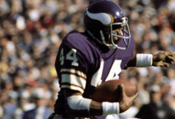
Opposite of perfection:

Re: Vikings uniforms.. What could have been.
Posted: Fri Aug 29, 2014 5:17 pm
by indianation65
Be bold, be different, what's old is new...go back to '62 with a current horn!
...wisdom
Re: Vikings uniforms.. What could have been.
Posted: Sat Aug 30, 2014 12:09 am
by PacificNorseWest
Coincidence you put up a picture of Favre under 'opposite of perfection,' NextQuestion? I think not!
Those uniforms were disgusting though, you're right. So much so that I refused to buy an AP jersey now matter what...Thank God they switched up because I got my AP last Christmas. Absolutely love love love their new getups.